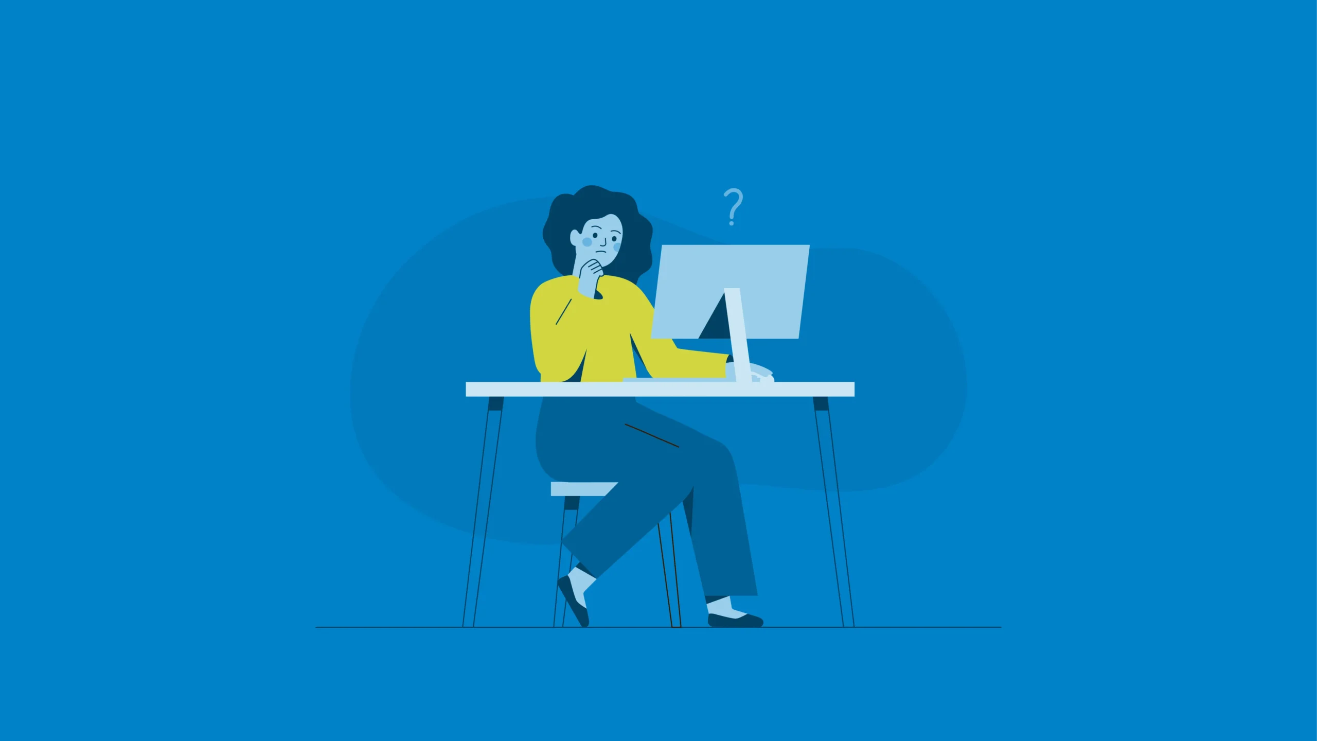
Your homepage is the front door of your business or organization, intended to give your audience a firsthand look at who you are and what you do.
But if you don’t optimize your homepage, you could end up with a bland, poorly designed digital storefront that drives your audience away instead of drawing them in.
Here are four mistakes that could be holding your homepage back from converting customers like it should—and what you can do to fix them!
1. The copy is all about you
Contrary to popular belief, your homepage should not be about you. Far too much copy is wasted telling the world what a great workplace you have, how many awards you’ve won, and how fancy your company vision is.
More than anything else, visitors to your website need to know how you solve their problems. They are the hero struggling to overcome, and you are the guide who can show them how to do it.
Your keys to fixing your copy:
- Start off your homepage talking about the problem your audience faces, and how that problem makes them feel. This problem is likely what sent them to you, so it’s also important to make sure your page title and meta description contain the right keywords to appear in related search results.
- Clearly state 3–4 benefits your audience will get if they choose to work with you. Paint a vivid picture of the life of ease and happiness they will experience when you solve their problem.
2. Your website’s visual user experience is lackluster
Take your inspiration from well-designed magazines, not a Russian novel. Your page copy should have structure, hierarchy, and compelling visual components that communicate clearly and draw eyes to your call to action.
Visual keys:
- Keep your paragraphs short (no more than 3–4 lines)—include links to blog posts for topics you think might be better discussed at length.
- Use headings, graphics, and other visual elements to break up content and provide a nice scrollable reading experience for your target audience.

3. You’re missing a clear call to action
If your audience is stuck with vague action steps like “Learn More” or “Click Here,” they won’t know how to move forward with you—or what they get when they do. A clear call to action makes it easy for the audience to take the next step to work with you.
Clarify your call:
- Create a single call-to-action button that clearly states their next step, whether that’s scheduling a call, ordering a product, or another concrete action—even better if you link to what they need for that action, like a phone number for scheduling the call.
- Put that button everywhere—two or three places on your homepage at a minimum.
4. Your load time is too slow
The average human’s attention span is just eight seconds, and one study found that 40 percent of people will abandon a page that takes three or more seconds to load. Make sure you’re answering your audience’s questions quickly, or they might start looking for another option.
How to fix it:
- Make sure your theme, code, and plugins are up to date. Run a speed test to see how well your site is performing under optimal network conditions.
- Resize and optimize video and images.
Need help transforming your homepage into one that wows and converts your audience?
Book a free 30-minute Discovery Call with TwoTone Creative and get the help you need to create a website that is right for your audience.

As our creative copywriter, Melanie helps craft what you want to say in the way you want to say it. With experience in social media management, feature writing, blog posts, and more, she’s passionate about connecting the dots between small details and big-picture ideas. Whether you need a snappy tagline, a compelling email message, or a social media post that keeps people coming back for more, she enjoys transforming ideas into stories that impact and inspire. She’s in her element when she gets to revitalize tired old ideas into fresh, new content, and loves tackling writing projects covering any topic.