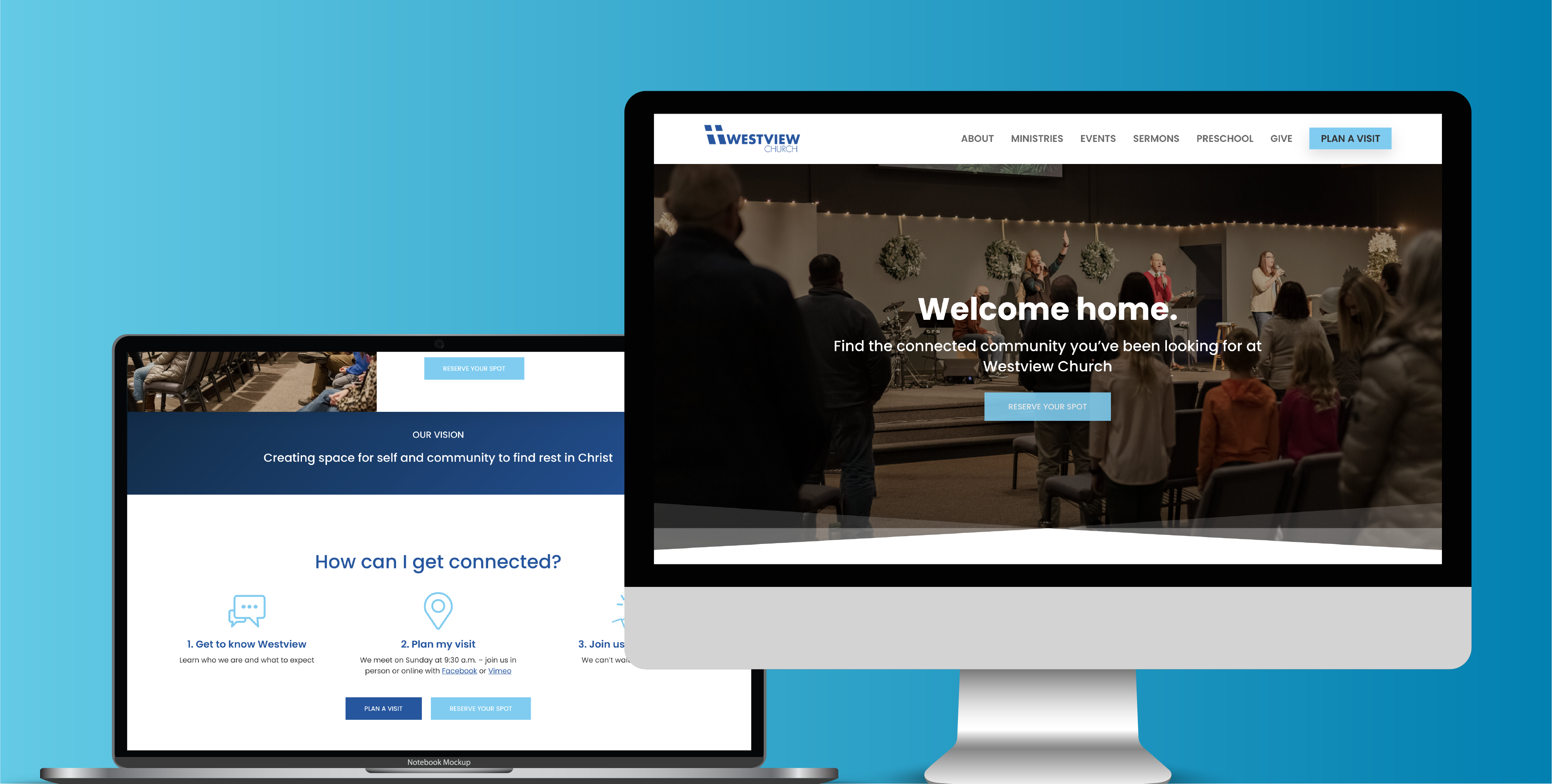
These days, your website is the first impression your church makes on a person – even before they step through the doors for a weekend service. But is your website making it difficult for potential visitors to get connected with you? Too often, poor church website design can turn people away from a church where they’d be a perfect fit.
Tired of your church website losing you visitors? Here are 10 common mistakes in your church’s website design – and how you can fix them.
1. No Clear Call to Action
Your homepage is filled with different buttons asking people to serve, join groups, and sign up for your latest event – but too much information can overwhelm new visitors who aren’t familiar with your church. Make their next step crystal-clear!
Create a single call-to-action button that reads “Plan a Visit” or “Come to Church” that clearly directs how and when they can attend a worship service. And put that button everywhere so it’s impossible to miss. (Yes, we mean EVERYWHERE - two or three places is a great start!)
Want help in crafting the perfect call to action? Book a website audit today!
2. Unresponsive Design
Responsive design is a pretty simple concept – it just means that your website adjusts to fit whatever window the user is browsing for an optimal experience. But when not put into practice, it can create cause for lots of scrolling, zooming in, and headaches for site visitors. A good UI/UX designer can help get your site optimized and create a user experience that keeps people coming back for more!

3. Cluttered Navigation
Think of your top navigation bar as a map that helps visitors know where to go on your site. If your navigation has too many elements or pages aren’t clearly named, your site will frustrate users and they won’t be able to find the information they’re looking for. Instead, put three to five simple categories at the top of the page, and leave the rest for your “junk drawer” at the bottom footer.
Ready to hire a web designer? Here are the 7 questions you should ask before hiring them.
4. Too Much Information
Less is more – and that goes for your church website design, too! A cluttered home page that highlights all of your ministries, programs, past sermons, and more will only confuse your site visitor. Instead, tailor your homepage to address the needs of the unique audience that your church wants to reach. Whatever your niche, make it clear in your home page copy that you’re the best church for your viewer, and save the other information for your internal pages.
5. Outdated Logos
Nothing says a website needs a little TLC like old, outdated graphics from 2005. While you don’t have to stay on top of every single one of the latest trends, best practices for design recommend updating your logo every 5 years. Is it time to update your church’s logo? Check out these 5 signs it’s time for an update.
6. Slow Load Time
Patience is a virtue, but no one wants to spend hours waiting for your homepage to load. Make sure that your plug-ins and add-ons are functioning properly, and double check that all your security settings and software are up to date.
Related: 10 Must-Have WordPress Plug-Ins
7. Unreadable Fonts
Not all fonts are created equal – and just because a font looks cool on its own doesn’t mean that it’s the best choice for your website’s body copy. Fonts that are too small, detailed or poorly matched with other fonts can cause viewers to reach for their reading glasses (or leave your site altogether). Choose a simple, clean font that’s easy to read and pairs well with several other fonts.
Need new fonts and branding guidelines for your church? We can help.
8. Too Much Text
No one wants to be greeted with a huge wall of text to wade through on their first visit to your site. Keep paragraphs short and simple, and use headings, graphics, and other visual elements to break up the content.
9. Outdated Content
Still got that community picnic up on the website from 2013? If you’ve got a thriving, active church, your website should reflect it! Make sure to keep events and service times updated so people can stay informed and involved in your church community.
Related: Website Platform Comparison: Squarespace, WordPress, and Shopify
10. Not Enough White Space
You may be tempted to cram your whole page with information, but white space can actually help you emphasize the most important elements on the page. Use white space to break up large chunks of information and make the home page easy for the eyes to scan.
If your website has more than a few of these problems, don’t worry – TwoTone Creative can help you build a beautiful, user-friendly website that clearly communicates your church’s mission and vision. Book a Discovery Call below, and transform your church’s website today!

With more than 10 years of agency experience, Jenny has had the privilege of working with a large variety of brands. She loves partnering with other business owners and entrepreneurs, and specializes in brand development. From digital marketing to online course creation, Jenny’s knowledge and skillset has prepared her to be a successful creative director.


