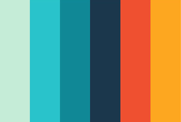
We all know how important color is within design. However, with a lot of the current design trends, creating interesting and cohesive color palettes has become even more essential in producing successful designs. For years, websites typically fell into one of two categories: white backgrounds or color backgrounds. But our digital tastebuds have evolved, and we’ve grown to love the precise and calculated use of color so commonly seen in print design. And this means that as web designers, we need to make sure we understand what it takes to create these impeccable palettes.
A Quick Look at Color Theory
Understanding color is the first step to applying it successfully in your design. Like anything else, color theory is a complex subject that analyzes how different hues/shades interact with one another. However a few basic tips can often be the difference between finding that perfect palette and falling flat on your face. When developing your schemes, consider one of the following “rules” as a general guideline to follow.
Analogous
Analogous palettes use colors that are close to each other on the color wheel. These palettes typically do a great job of communicating consistency and uniformity within design. They’re also relatively easy to work with because there isn’t a large differentiation in hue. Instead, contrast is struck primarily through the variations in color shade, limiting any distraction away from content.
You can see the effects of the analogous palette above. While it utilizes all cool colors, the lighter green accent offers interest without distracting from the softer blues. Most three-color analogous palettes use the same chroma, but this one shows how adding tints and shades can create a wider and more gradual variation.
Complementary
Complementary palettes are created with colors that sit opposite each other on the wheel in order to offer a sense of balance. Like analogous palettes, adding various tints and shades can expand these schemes. This is especially helpful in avoiding a harsh contrast that can create eyestrain when two opposing colors are placed next to each other.
Note: This is an example of why color placement is important; be aware of how colors look next to each other and how they make the viewer feel. If the combination is too jarring or distracting, separate them with a transitional color or white space. The wide range that a complementary scheme offers makes this palette extremely versatile, interesting and balanced.
Triadic
The triadic method consists of three main colors equally spaced on the wheel, which makes for a diverse palette. This takes a little more thought and experimentation, as it involves a larger number of hues that oppose each other.
The contrasting colors here are softened with tints, and additional shades of the same hues look as though other colors have been added. This is a good way to add neutral tones to offset the brighter colors.
How Current Trends Are Creating Palettes
As minimalistic trends have grown in popularity, there’s been a big shift towards utilizing bold colors as a way of supplementing the removal of other design elements. With often-simple interfaces, this emphasis on color acts not only to guide the viewer’s attention to important elements, but also to make a design feel more memorable. While there are a lot of unique approaches, there are 3 major trends that can be commonly found today.
Pastels
The use of muted, pastel-like colors has grown in popularity with the rise of “flat” design. These palettes tend to use between 4-5 primary colors, with many variations in shade. When viewed together, these less-saturated colors offer a soothing sensation that works well in large doses, with prominent color blocking.
Bright
As a way of standing out against a myriad of bland designs, many designers have taken to using very bright and saturated colors to make elements “pop.” Typically used with only a few other primary colors, these designs will often have lots of “white” or “gray” space in order to equalize the starkness of their palettes.
Monochromatic
Another popular color style is a monochromatic scheme – often blues, reds or black/gray – with a pop of bright color for accent. This is effective because the monochrome conveys an emotional or psychological message, while the accent color calls attention to important page elements and guides the user’s eye.
Showcase of Successful Color Palettes
Windows of New York makes solid use of a complementary scheme. The hues are muted to build the site’s purpose of reflecting a calm minimalism, meant to encourage its viewers to step out of a chaotic world to notice the beauty in simple things.
Truf is a great example of the use of monochromatic color: a palette of neutrals, accompanied by a bright red signature color. This site develops the brand’s identity by communicating a sleek, functional stance.
Simplisafe’s digital security quiz makes use of a pastel like color palette. The muted background colors, while in large portions, never seem to overwhelm the viewer while still commanding a strong prescience.
A sophisticated, bold background allows for the pops of color to illustrate the hierarchy of page elements in this design. Even the photos are consistent with the color scheme, which makes for a cohesive design: assuring users of the brand’s expertise.
Color Palette Resources
There is a multitude of tools available to aid you in your color design. Here are few distinctive and helpful ones.
- Shutterstock Color Spectrum: This unique image discovery tool has an interactive interface that caters to the visual minds of designers by allowing them to search a library of images by color, rather than keyword. A great tool for brainstorming with color, you’ll discover new areas of ideation through its real-time feedback.
- Color Hunter: This tool is for you if you already have an image or photo ready to implement into your project. This app allows you to upload your image, which it then extracts a color scheme from. You can dictate and alter the colors it chooses until you’re satisfied with the palette. It then provides an easy transfer to your design by giving you the Pantone numbers of your creation.
- ColourLovers: If you’re looking to keep up with the latest color trends, become a part of this creative community – in which you can create, share and browse colors, palettes and patterns. Discuss methods and trends with other designers and learn from articles focusing on color: all this will contribute to a more wholesome understanding and practice of choosing color for your designs.
The most successful color palettes are those that develop your brand’s identity and clearly convey the right message to your audience. The best way to build up to a solid palette is to use these examples and tools for inspiration and brainstorming, and then test, edit and experiment with your designs to choose what works best.

With more than 10 years of agency experience, Jenny has had the privilege of working with a large variety of brands. She loves partnering with other business owners and entrepreneurs, and specializes in brand development. From digital marketing to online course creation, Jenny’s knowledge and skillset has prepared her to be a successful creative director.


